By now you will have heard of TikTok. Marketing’s latest goldmine has taken the social media landscape by storm, creating new opportunities for brands and businesses alike.With 689 million monthly active users and new business accounts being launched everyday, TikTok is here to stay, so here’s how your brand can make the most of this … Continued
-
Blog
-
The biggest rebrands of 2021


- Published 25th Jan 2021 • Updated 25th Jan 2021
2020 was a year of change. While many businesses were forced to close their doors, others rebranded to signify a new era. To keep you inspired with ideas for your own rebrand, we’ve rounded up the best and biggest rebrands of the year.
During the pandemic, when adapting to the changing market became the priority, logos everywhere got paired back and stripped down. Brands pushed for greater versatility and accessibility, as we saw a move towards simplified logos and refreshed colour palettes.
Some businesses underwent massive changes in redesigning their brand to reflect the new direction they were taking, while others returned to their roots by reviving old logo designs for a friendly and familiar feel. Here is a selection of the brand changes we will see going into 2021.
Even the smallest change can help your brand feel refined and refreshed. Get in touch with our talented team of brand specialists today to keep your brand on track.
Burger King
At the start of 2021, Burger King unveiled its first rebrand in 20 years. Leading the retro revival, they ditched their 1999 logo in favour of a flat design reminiscent of the logo used by the brand throughout the 1970s-90s. The simplified logo debuted a ‘craveable’ custom typeface and a fresh colour palette directly inspired by the food itself. The revamped logo, packaging and uniforms pay homage to the brand’s heritage with a refined design that is confident, bold and refreshingly familiar.

Fisher Price
The Fisher Price rebrand comes as a part of a greater brand identity refresh. The new logo aims to refine the iconic Fisher Price identity by creating flexibility for a range of contexts. The subtle changes capture the essence of brand while revitalizing it into a timeless state. By switching from uppercase to lowercase letters and creating a smile from the hyphen, they reinforce a childlike experience and reaffirm their brand story.

Bloodwise/ Blood Cancer UK
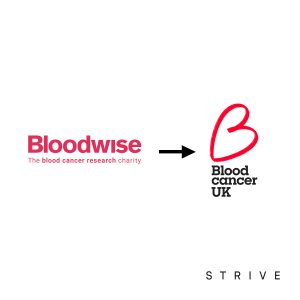
There are many reasons why a business may rebrand but perhaps the greatest motivator is if it is not properly understood by your target audience. This was a problem experienced by ‘Bloodwise’ the blood cancer research charity, that was rebranded to Blood Cancer UK in 2020. The change to their name and visual identity came as a result of their audience not understanding the purpose of the charity, with many believing it to be a blood donation service. The rebrand effectively simplified their message, ensuring the purpose of the charity was clear to see.

GoDaddy
GoDaddy unveiled a brand new look and feel in 2020 with their updated logo and philosophy. The rebrand puts greater focus on their brand vision of empowering the ‘everyday entrepreneur’. By highlighting the ‘Go’ in ‘GoDaddy’ with a heart symbol, they build a more personal, heartfelt brand that aims to help small businesses succeed.

Adobe Creative Cloud
In order to better unify all of their individual applications, Adobe revamped the Creative Cloud logo. The new design brings all the colours of their product brands and their new corporate red together into a single gradient. The rainbow represents the umbrella of creativity that makes up Adobe Creative Cloud, effectively combining professionalism and freedom into one design.

Pfizer
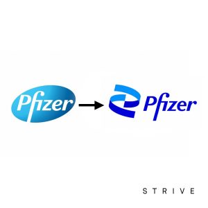
Fresh from releasing a Covid vaccine, Pfizer revealed a new logo and identity to mark a shift from ‘commerce to science.’ The pharmaceutical company underwent an identity overhaul with a new logo, typeface and dual tone colour palette that aimed to signal a ‘new era’ for science and research. Inspired by DNA’s double helix structure, the bold design of the new logo aims to show how the company is prompting ‘world shaping science’.This is offset by their use of human focused photography that depicts ‘real people getting the help they need.’

Cadbury
With the launch of their new chocolate bar ‘Marble’, Cadburys wanted to humanise their existing logo by drawing on the signature of William Cadbury, the grandson of the firm’s founder. The new gold logo gives a hint of luxury and authenticity to the brand’s multi billion dollar legacy. The refined look is part of a greater trend towards recreating historic logos with a new era in mind.

BMW
After 20 years of the same design, BMW has released a new two dimensional version of their iconic logo. The white and blue of the new logo represents the spinning of a propeller on a blue sky, a nod to the Bavarian state and their beginnings as aeroplane manufacturers. This design element is elevated in the rebrand with the removal of the black border. The refreshed logo uses simple, clean lines to represent mobility and the future of the company compared the previous more rigid, and traditional design.

As we can see with these rebrands, it is important to regularly check in with your brand to make sure it still works for you as a company. Some questions to reflect on are; does your brand still accurately reflect your vision? Does it differentiate you from your competitors? Does it communicate who you are as a business? If not, it may be time for a rebrand.
At Strive Digital, we bring brands to life strategically, digitally and creatively. We can help you stand out with our expert team of designers, developers and marketers. Get in touch today to find out more.
Get in touch
More blog posts
-
How to Create a TikTok Marketing Strategy for Your Brand
- Published 21st May 2021
Read blog
-
5 Key Benefits of Outsourcing Your Social Media Marketing
- Published 21st May 2021
Read blogNo one knows their business better than you do, so it’s natural to assume that you would be best placed to handle your companies social media presence. While this is true, the day to day tasks of running a business is often enough for the average CEO, causing their social media to fall to the … Continued
-
Six Signs That it’s Time for a Rebrand
- Published 20th April 2021
Read blogIn the life of a business there comes a time when a rebrand may be necessary. Change can be daunting, but it can also be a great way to breathe new life into your business. So, how do you know if your company needs a rebrand? Here are the top 6 signs that your branding … Continued
-
Six Simple Methods to Increase Checkout Conversion Rates
- Published 19th April 2021
Read blogEcommerce conversion rate is the metric used to measure the success of your business. While site visitors and interactions are important, it is only the checkout process conversion rate that will bring in actual revenue. This is why optimising your website for more sales is essential. Here are six actionable strategies you can use right … Continued
-
5 Reasons Why Email Marketing is Not Dead
- Published 30th March 2021
Read blogEmail marketing isn’t dead and it’s not dying anytime soon. While its longevity is often debated, for businesses email marketing still plays a vital role in nurturing, acquiring and retaining customers. Here are 5 reasons why email marketing is here to stay. Email volume keeps increasing and according to Statista data, it will continue to … Continued
-
Why WordPress is the Best Platform for Your Business
- Published 22nd March 2021
Read blogChoosing a platform is the most important decision you will make for your new website. Your choice of content management system will dictate how your website looks and how well it runs. This is why picking the right provider for your brand is crucial, fortunately, there is one option that stands above the rest. WordPress … Continued